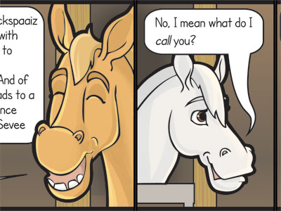
Maryanne’s musings: It’s the Doctor Who crossover nobody asked for! ;D
I love blue horse floats (we call them floats in Australia. Apologies if they’re trailers or horse-boxes in your neck of the woods). I’ve seen a couple in traffic that are Tardis-like. I also wonder what horses think about the whole traveling thing. My horse won’t go into the float unless it’s clear there’s catering in the front. So anyway this comic has a horse who’s a bit of a “Doctor” character and thinks there’s more to the float than meets the eye. It must be so odd for horses to walk into a trailer at their home yard and then exit in a completely foreign environment.
I redrew the float a few times. The first time the lines were too heavy and now looking at the comic scaled down on the page I think they could have been heavier. The challenge with having 4 different elements in the same panel (float, girl, horse and horse) is that they’re usually sketched up and inked separately and if one has much heavier lines it dominates the panel. When the float had heavy lines it was really dominating. The thing closest to us (buckskin horse) should have the heaviest lines. It’s something I want to work on: Be brave with thick lines and consistent.
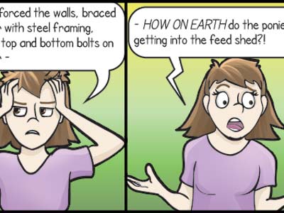
One other interesting thing is the girl. She’s about as dull and washed out colour-wise as I could make her because she plays no part in the comic. I can’t have horses load themselves into the float. I wanted her to be very forgettable. The person presumably holding the buckskin horse isn’t shown at all, but he has a lead just the same.


